The Psychology of Airplane Interiors: How Color Choices Enhance Passenger Experience
The seemingly mundane details within an aircraft cabin are, in fact, meticulously crafted to influence passenger well-being and perception. Boeing, a titan in aircraft manufacturing, produces thousands of planes annually, each a complex symphony of engineering and design. Beyond the structural integrity and technological advancements, the interior aesthetics play a crucial role in shaping the overall flying experience. This includes the deliberate selection of colors, a decision deeply rooted in the principles of color psychology.
When an aircraft is outfitted, every element, both inside and out, undergoes rigorous consideration. Boeing has previously shed light on the psychological underpinnings of their interior color palettes, revealing a strategic approach to making air travel more comfortable and less stressful.

The Calming Influence of Blues and Greens
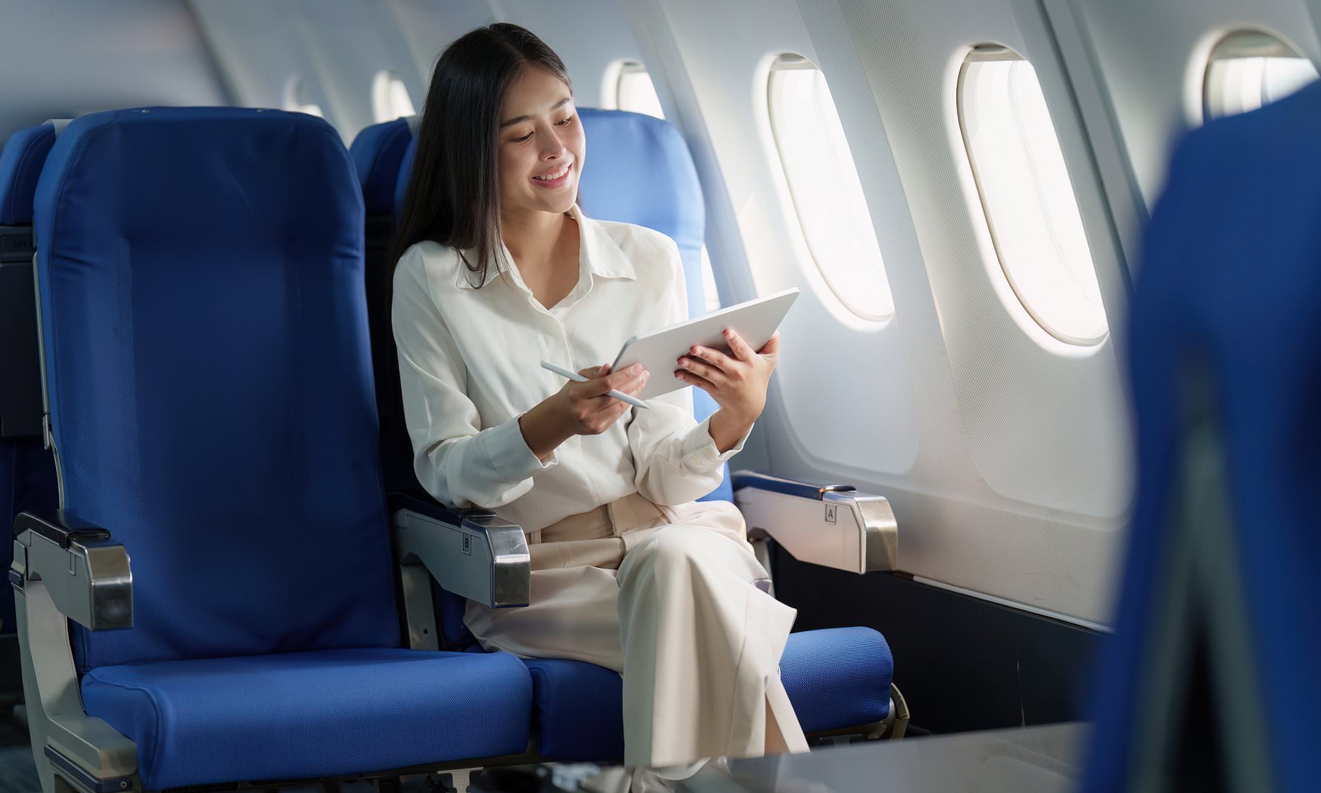
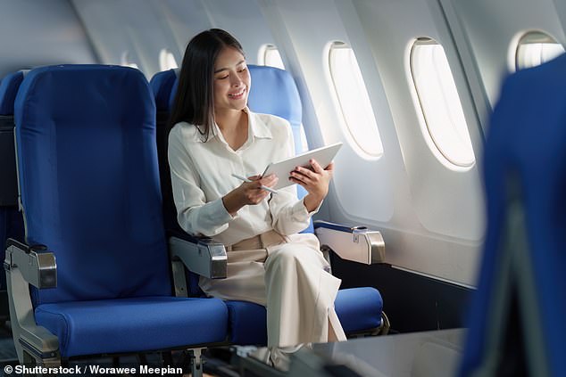
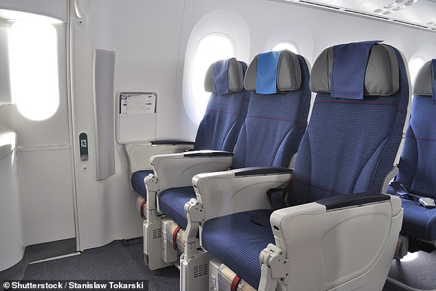
The prevalence of blue in airplane seating is no accident. Designers leverage color psychology to evoke specific emotional responses. Blues and greens are widely recognized for their association with peace and tranquility. This connection is vital in an environment where many passengers experience stress, despite air travel being statistically one of the safest modes of transportation.
Rishi Kapoor, CEO of Nanak Flights, explained the calming effect of blue to Reader’s Digest. He noted that even though flying is inherently safe, anxiety can still be a significant factor for travelers. “It might seem like an insignificant detail, but it’s one that helps make flying the best way to travel,” Kapoor stated, highlighting how seemingly small design choices can contribute to a better overall experience.
Aviation designer Nigel Goode further elaborated on the nuanced use of color in aircraft interiors when speaking with The Telegraph. He observed that while budget airlines might opt for more vibrant and bold shades, most carriers lean towards muted tones. “The overarching aim is to create a home-like relaxing feel, so airlines tend to use muted colours that feel domestic, natural and earthy for that reason,” Goode explained.
The Historical Significance and Corporate Symbolism of Blue
Goode also delved into the historical reasons behind blue’s widespread adoption. He noted that blue has become a color of choice due to its conservative, non-contentious, and corporate nature. It symbolizes trustworthiness and safety, making it a natural fit for established airlines. “You see it used in all of the older airlines like British Airways,” he added, pointing to its long-standing association with reliability.
The specific shade of blue also plays a role. Lighter hues can create an illusion of greater space and height within the cabin, making the environment feel more open and airy. Conversely, darker shades can contribute to a perception of the space being smaller and more confined.
Color’s Impact on Sensory Perception
Beyond emotional responses, colors can also influence a passenger’s perception of the cabin environment itself. Virginia Tripp, a designer at Teague, previously shared with Boeing that colors can “influence a person’s perception of humidity, temperature and aroma.”
For instance, blue can evoke a sense of freshness and cleanliness. When combined with green, it might lead passengers to perceive the cabin as cooler. In contrast, warmer colors like orange can create a feeling of increased temperature. Similarly, pink has been associated with the perception of a sweet fragrance, adding another layer to the sensory experience designed for travelers. These subtle psychological cues, woven into the fabric of the cabin design, aim to enhance comfort and reduce the inherent stresses of air travel, transforming a functional space into an environment conducive to a pleasant journey.